Beyond the Template: Why Nepal’s Travel Websites Lag in UX and How to Fix It
A data-backed technical analysis of over 100 Nepalese travel sites. Learn how generic templates, poor Core Web Vitals, and missing trust architecture hurt booking conversions—and how to modernize your platform for high-intent travelers.
The Digital Landscape of Nepal’s Tourism Industry
Nepal is home to thousands of trekking and tour operators, each offering world-class experiences. However, after reviewing over 100 Nepal travel websites, a clear pattern emerges: while the hospitality is elite, the digital experience often feels frozen in time. Many sites suffer from outdated layouts, sluggish performance, and a lack of user-centric design. This review isn't an attack on individual businesses; rather, it's a strategic look at why so many sites feel stuck in 2018 and how agencies can bridge the gap between their physical expertise and their online presence. By understanding the common pitfalls of a template based business in Nepal, owners can implement high-impact changes that drive trust and conversions.

The Template Trap and Visual Monotony
A primary observation across these 100+ sites is the heavy reliance on generic, pre-made themes. While templates offer a quick entry point, they have led to a "sea of sameness" where logos are the only distinguishing factor. This template based business in Nepal often overlooks the need for unique storytelling. When a traveler visits five different tour companies and sees identical layouts, the brand value dilutes. International leaders like Intrepid Travel succeed because their UX reflects their unique brand voice—something many local sites lack.
Performance and the Mobile-First Reality
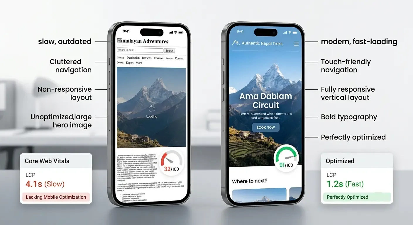
According to Google’s PageSpeed Insights, many local travel sites struggle with Core Web Vitals, particularly Largest Contentful Paint (LCP). Large, unoptimized images of the Himalayas are common culprits. Since most travelers research trips on mobile devices, a slow, non-responsive site is a major deterrent. Accessibility is also frequently ignored; many sites lack proper color contrast or ARIA labels, alienating a segment of the global audience.
Trust Signals: What Travelers Are Looking For
Users decide to trust or leave a site within seconds. Key trust signals often missing include real-time availability, transparent pricing, and authentic user-generated content. Instead of stock photography, travelers want to see real faces and recent trek photos. Professional UX design focuses on "information architecture"—making it easy to find specific trip details without clicking through five layers of menus. Nielsen Norman Group research highlights that clear, accessible contact information and professional design are non-negotiable for high-ticket bookings.
Case Study: Revamping specialized services
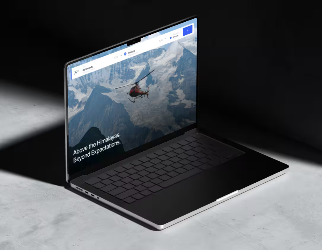
Consider AeroConnect Nepal, a provider for helicopter services. Their current platform is functional, but there is significant room for a UX revamp to match the luxury nature of helicopter travel. Suggested improvements include:
- Immersive Hero Section: Replacing static images with high-definition, compressed video backgrounds of flight paths.
- Interactive Fleet Gallery: Using clean, hover-effect cards to show technical specs of the helicopters.
- Simplified Booking Funnel: Reducing the number of fields in the inquiry form to increase the conversion rate of high-intent leads.
Actionable Steps for Growth
To move beyond the 2018 design aesthetic, Nepal's tour companies should prioritize speed, mobile-first indexing, and custom UI elements. Investing in high-quality, original content and optimizing for local SEO will provide a much higher ROI than simply buying another generic template. The goal is to create a digital home that is as breathtaking and reliable as the mountains themselves.
Collaborate with me
Contact me directly:
apsan@apsan.com.np